How to Improve the Onboarding Experience with UX
Onboarding is like dating—a nice experience will keep you interested in your partner and gradually strengthen your relationship. A weird and confusing experience, though, will most likely result in a quick parting of the ways after the second or third date. Onboarding works the same way.As ChartMogul notes, “‘Customer Onboarding’ is an umbrella term that’s often used to describe the entire process that users go through when they start their journey as a customer of your product or service. The onboarding experience can define the ongoing relationship your customer has with the product.”Whether it’s onboarding a free trial user or a paying customer, you have to keep making a good impression consistently by providing a smooth and enjoyable experience. According to UserPilot, “No matter how good your product looks, it won’t be revolutionary unless the onboarding experience captures users’ attention and immediately shows the value that you provide.”In other words, if you want to keep your users coming back for more, then you need to take onboarding seriously and spend time on improving the entire process.Not doing so will result in a series of risks for your business.
Risks of designing a poor onboarding experience
 Your product can be highly valuable and well-aligned with people’s needs, yet a poor onboarding experience may lead to unwanted consequences. Here are some of the risks:
- Not presenting the true value of your SaaS platform. Regardless of how good your product is, people won’t discover its real value if they don’t have the patience to use it. And this can easily happen, especially when using your product comes with a series of issues and challenges. People want an easy introduction to a product. We all have a short attention span, and we’re not willing to waste our time on things that are confusing and badly designed.
- People not recognizing the real potential of your product. Let’s go to the basics: What is an onboarding experience? It’s getting people accustomed to your product and teaching them how to get the most out of it. A bad onboarding experience, however, will result in a weak understanding of the product, meaning people won’t know how to use it and will think it won’t work for them.
- Not converting free trial users into paying customers. This is a big one. You can’t afford to lose prospects, yet you’ll do so if you provide a poor onboarding experience. Think about it: You decide to try a SaaS product for free, and then you find out that it’s confusing and the onboarding experience is badly designed. Will you go forward and spend money on it? Probably not.
- The possibility of people leaving bad reviews about your product. Why do we purchase SaaS products? Because we want to make our lives easier. We don’t want to invest too much time or effort into learning a new platform. We want to understand the basics and start using it (or better yet, get our wanted results) right now. A poor onboarding experience, however, will make users feel deceived. This feeling may lead to bad reviews on sites such as Capterra or G2Crowd. And that’s something that can impact your brand greatly.
- A high churn rate. That’s expected, isn’t it? A bad onboarding experience will lead to a higher churn rate, as people will search for better solutions that are less confusing.
Are you willing to take these risks? After all, you’ve built this SaaS product to help your industry, and having a good onboarding process is part of the value you want to create for your target group.How can you achieve this result? There’s only one clear answer: By getting serious about onboarding UX.
Introducing onboarding UX
According to UserPilot, “Onboarding UX uses psychology to understand users’ goals and motivations so you can design an experience that helps them to see how the product meets their needs.”The article goes on to note, “Crafting an engaging onboarding UX requires marketers, product managers, designers, and even customer success teams to work together to deliver value and to push the users towards an “aha moment.”In other words, onboarding UX refers to designing the process your users will have to go through when discovering and using your product. This process is like a touchpoint map, which outlines the interactions people have with your SaaS product, along with the ways in which your system can guide them making the discovery process less confusing and more engaging.But how you can design a friendly, yet powerful onboarding experience for your users? Are there any steps to consider? To help you out, we’ve put together a series of insights and onboarding UX approaches that will make your work much easier.
How to improve the onboarding experience of your users with better UX
Step 1. Reduce the learning curve
Every software package comes as a learning challenge. Before using your SaaS tool, people have to invest some time and effort into learning it. The faster someone learns how to use your software, the faster they’ll discover its added value and achieve their desired goals.In other words, the learning curve is nothing else than the graphical representation of the progress a user makes when learning how to use your software. If the learning curve is steep—or better said, when the entire learning experience is difficult—people may give up and search for a different tool.So start by reducing the learning curve and making your software easy to understand. Apart from designing a user-friendly tool, you can also design the learning experience by providing the necessary information and guidance to ensure that your trial users or paying customers will feel supported and cared for throughout their learning process.
Step 2. Add a progress bar to indicate task completion
When using a SaaS platform for the first time, chances are people will feel unsure if they’re heading the right way. Let’s say that you’ve developed a SaaS marketing automation platform and someone is using it to design an automated lead nurturing email sequence. To achieve the end result, your users will have to accomplish a series of tasks. They’ll have to upload their subscribers’ list, design their email templates, and create a series of messages, setting up the sending time for each one.To ensure they have an easy onboarding experience, add a progress bar that indicates the completion of each micro-task that leads to a specific goal, like launching a lead nurturing sequence. This simple element will make people feel more secure about the actions they’re taking and help them estimate how much time and effort they’ll need to achieve a specific objective.
Step 3. Break the onboarding experience into smaller phases
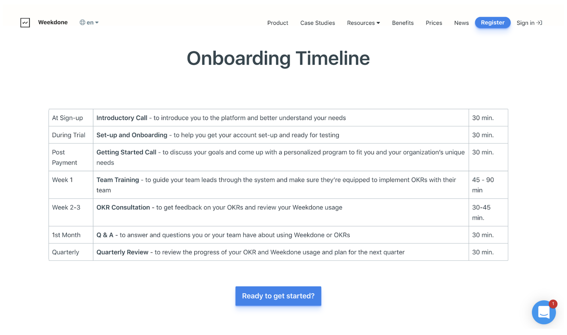
In some cases, onboarding can feel overwhelming. To keep that from happening, break the onboarding experience into smaller phases and communicate them to your users. Weekdone does this perfectly. As you can see, the company has created a boarding timeline that includes phases such as the introductory call, the setup, and the getting started call. What’s interesting is that Weekdone broke down the onboarding experience depending on the buyers’ journey phases, starting with the sign-up and free trial periods and then extending it to the post-payment and the next weeks, and months afterward. This clear breakdown will make your users feel truly assisted and know what to expect when purchasing your product.
Step 4. Connect with your users through good copy
Whether it’s your landing page or product dashboard, how you word things is vital. A clear and concise copy will help you guide your users successfully and make them feel truly empowered and ready to use your software. So stop using those generic calls to actions and write something more meaningful and attention-grabbing instead.For example, instead of a “New Project” button, write “Create your first project.” Rather than “New email campaign,” use “Send your first email campaign.” These simple wording tweaks can make all the difference, making people feel more confident and eager to start exploring your product.
Step 5. Design a product discovery workflow and map the “aha” moments
You can’t just let people discover your software by themselves—you need to actually design this process and decide how to steer people through the learning process. That’s why you’ll want to create a product discover workflow and identify all the “aha” moments.For example, if you’ve developed an event planning software, write down all the phases your users will have to go through to launch their first event, along with the possible “surprise” moments. These “aha” moments can be something like the first time your user will visualize the event website they’ve built with a special composer.
Step 6. Analyze your users’ behavior and eliminate any potential roadblocks
Don’t just set up the onboarding experience and forget about it. This is not how it works. On the contrary, it’s an ongoing process you’ll want to improve constantly. To do that, analyze your users’ behavior and map all the troublesome elements that make the learning process stressful. People will start to enjoy the onboarding experience and integrate your product into their workflow.
Bonus step:
Right from the first moment your new trial user experiences your product, ask them for feedback. You can set up a specific board to collect and manage user feedback (from trial users, or from paying customers as well) with Upvoty. This way, you are more likely to learn more about their roadblocks, and, it's been proven to reduce churn rate because trial users can see what new cool features are "in the pipeline" and thus they are more likely to stick around.
Final takeaway
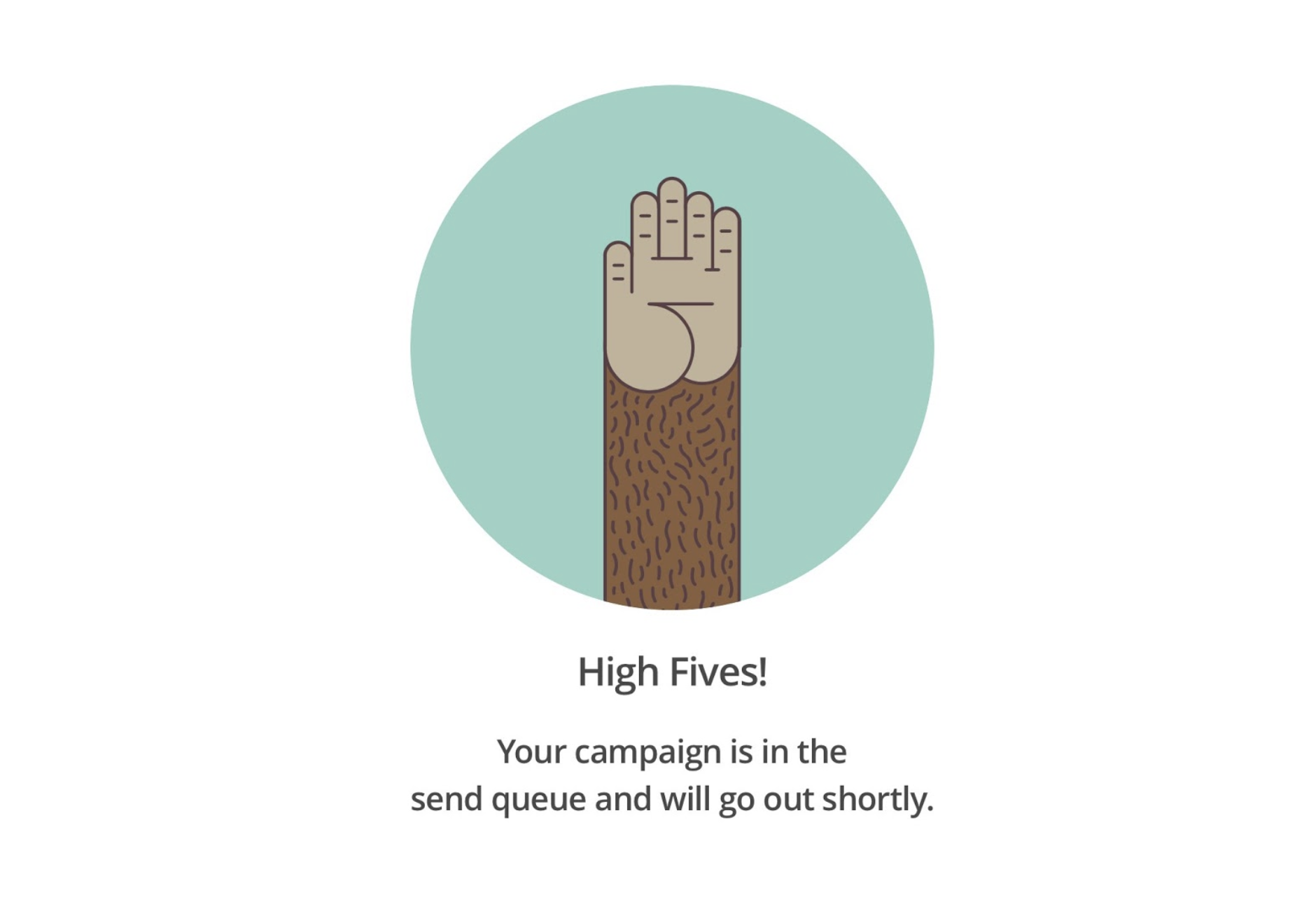
We could talk for hours about onboarding and still come up with new insights and tips on how to improve the overall experience for your users. There’s no shortage of adjustments and new approaches that can make your onboarding experience truly enjoyable and memorable. But no matter how you map and design it, remember one thing: Always celebrate your users’ micro-successes. Think about the high-fives someone will get on MailChimp after sending an email campaign. It might seem small, but onboarding is about the feeling your users will experience when interacting with your product. So make them feel accompanied and welcomed. That’s the key to a memorable and awesome onboarding experience.

